Artifact Visual Identity

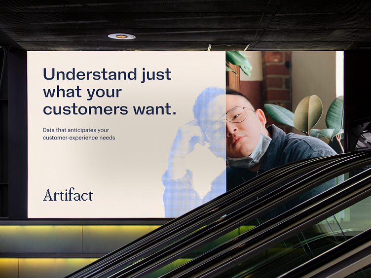
For customer experience and product teams, qualitative data is where invaluable customer insights live. It’s full of trends and common pain points that can be leveraged to better understand consumers' wants and needs, and Artifact is one of the first technologies to harness the power of this data in a robust and accurate way.
Artifact partnered with Focus Lab to create a strategic look, feel, and story to match the deep value they bring to their users, and their customers.
In the way that the same visual appears differently from varying distances, Artifact’s visual language provides a sense of dimensionality. Take the logo's dots, for example: they represent data, fluid and always moving. The difference is in the details, and that's why another opportunity identified in strategy created further brand distinction.
We're talking about color.
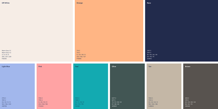
The Focus Lab team knew a warm color would help Artifact stand out in the competitive landscape. So, we explored non-traditional neutrals in cream and navy paired with a leading orange, simultaneously soft and full of energy. The unexpected combinations feel fresh, innovative, and intentional, and forge a unique color system.
Click here to view the full case study.
---
Looking for a brand agency? We would love to hear from you.
Email us: hello@focuslab.agency