Surfe Logomark

The Surfe logo is inspired by the sense of flow and flexibility required to ride a wave as well as respond to its ever changing nature. The system is made of four core components: the primary logotype, the Puddle Jumper for small-scale legibility, the Floater, and the Barrel.
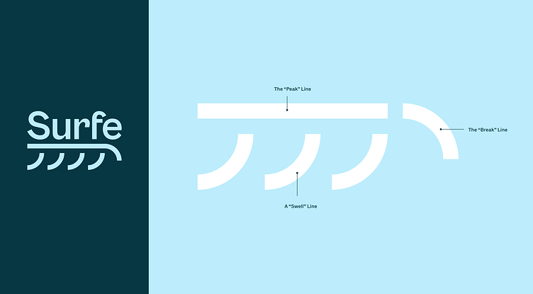
These lockups are built with a “Swell” line, “Peak” line, and “Break” line, allowing them to endlessly stack and extend into the brand’s visual language.
Click here to check out the full case study.
---
Looking for a brand agency? We would love to hear from you.
Email us: hello@focuslab.agency


