Focus Lab Rebrand

The logomark started with a feeling. That feeling when something clicks. A burst of clarity when you discover exactly who you are. The exact moment when you realize that all the potential — something that’s been in you this whole time — has finally been revealed. That's what we want to bring to our clients and what we believe brand is capable of.
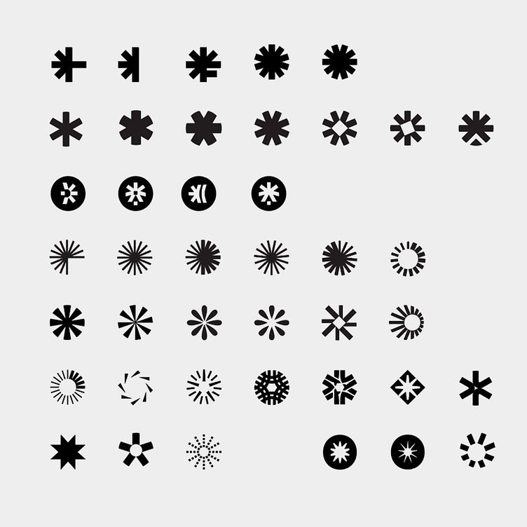
We explored asterisks, star bursts, keyholes, fractals, comets, and more asterisks. Eventually, we found our Flare: asymmetrical with a sense of motion, simple yet unique, classic and timeless. We paired it with a logotype built from a modified version of the Karelia typeface. It carries a mechanistic, grotesque flavor while showing uniqueness in its irregularities. As a logotype, this is the sweet spot between wild and conformist, fitting in and standing out.
Learn more about our internal rebrand here.
---
Looking for a brand agency? We would love to hear from you.
Email us: hello@focuslab.agency