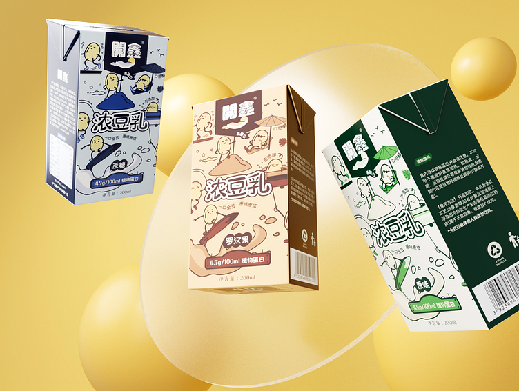
Kaixin Soy Milk Packaging Design
Pure - All Natural, 0 Additives
We chose the color most reminiscent of natural/pure - green/blue. Green/blue is the most natural/pure color in the public mind, which makes it easier to visually communicate the natural/pure nature of the product. The natural green was used for the original flavor, and the pure blue was used for the sucrose flavor. The Luo Han Guo flavor uses the natural color of Luo Han Guo, allowing consumers to naturally associate the taste with the color to reduce memory costs. Due to the public's lack of awareness of sucrose's color, we chose blue which represents pure for the sucrose flavor, to express the meaning of "sweet soy milk without adding any other substances except sucrose."
Services provided:
3d art
Illustration
—
Have a project you'd like to collaborate on?
Contact us: info@marcatostudio.com
—


