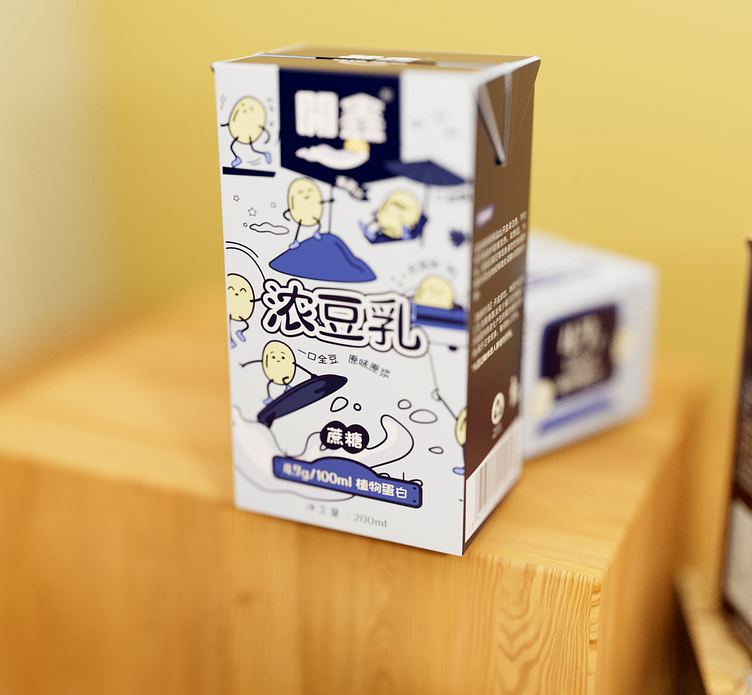
Kaixin Soy Milk Packaging Design


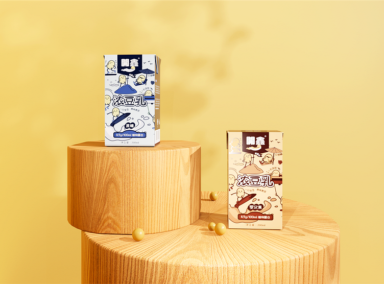
In order to make Kaixin (means happy) Soy Milk stand out among many soy milk brands, we sorted out the selling points of their products and conveyed them in the packaging design.
Kaixin - meaning to bring joy to people
We created the brand spokesperson of Kaixin Soy Milk - "Happy Bean" to emphasize the brand's happy gene. Based on the shape of the soybean and adding anthropomorphic elements, we outlined simple lines of the mascot and described its life through minimalist style comics, conveying the product's "healthy, high-quality, zero additives" characteristics and enhancing the sense of value of the product. It also makes the product packaging stand out among highly homogeneous soymilk brands, and increasing its pull rate on the shelves.
Services provided:
3d art
Illustration
—
Have a project you'd like to collaborate on?
Contact us: info@marcatostudio.com
—


